- Published on
Design to Engineering Handoff
- Design Systems
- Common mistakes in Shared Vocabulary between designers and engineers
- Examples of a Shared Vocabulary between designers and engineers
- Code Version of Figma's Dev Mode
- Summary
- Performance & Optimization Considerations
- Accessibility Guidelines
- User Flow Diagrams & State Management
- Technical Documentation & Implementation Guidelines
Design Systems
Design System & Component Library: More than just a style guide, a design system is a collection of reusable components, guided by clear standards, that can be assembled together to build any number of applications. This not only promotes consistency across your designs, but also allows for easier implementation by engineers. Your component library should include
This is the most critical concept to get right. Without a design system there is no shared language between designers and engineers.
How can we expect engineers to build a product that is consistent with the design if there is no shared language?
Lets Dive into how we can create a system that establishes a shared language between designers and engineers.
Common mistakes in Shared Vocabulary between designers and engineers
| Shared Language Concept | Common Mistake |
|---|---|
| Camel Case (common in programming) | Using spaces or underscores, i.e., buttonPrimary vs button_primary or button primary. |
| Kebab Case (common in CSS) | Using spaces or underscores, i.e., button-primary vs button_primary or button primary. |
| Case Sensitivity | Inconsistently capitalizing, i.e., FooterLink in one place and footerLink in another. |
| Descriptive Naming | Being too vague or too detailed, i.e., element vs leftSideNavigationBarUpperPart. |
| Numeric Incrementation (Button1, Button2) | Skipping numbers or not using zero indexing, i.e., Button1, Button3, Button2. |
| Folder Structure | Unorganized files leading to confusion, i.e., not categorizing assets or components into folders. |
| Consistent Spacing and Indentation | Using different number of spaces or tabs for indentation, i.e., 2 spaces vs 4 spaces vs tabs. |
| Use of Abbreviations | Using unrecognizable abbreviations, i.e., btn instead of button without prior agreement. |
| File Naming Conventions | Lack of consistency, i.e., homePage.svg for one asset, then about_us_page.png for another. |
Examples of a Shared Vocabulary between designers and engineers
There are many tools trying to bridge the gap between designers and engineers. One of them being Figma. With their latest Beta release of DEV mode, designers are much more empowered to create a shared language with engineers. This is a huge step in the right direction. Lets take a look at this feature and how it can be used to create a shared language.
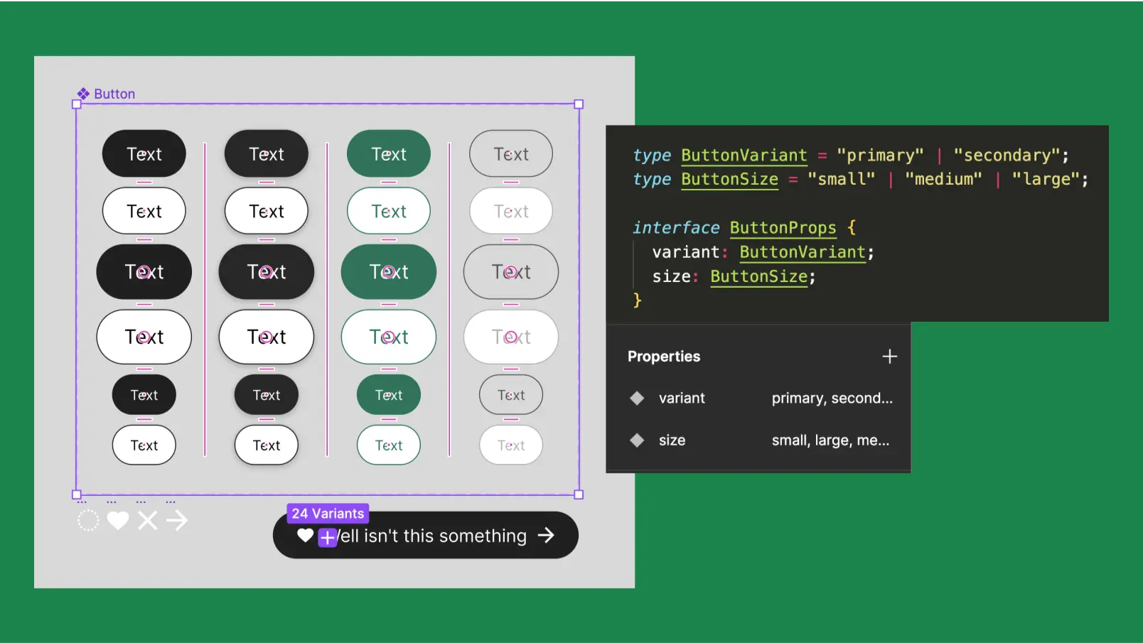
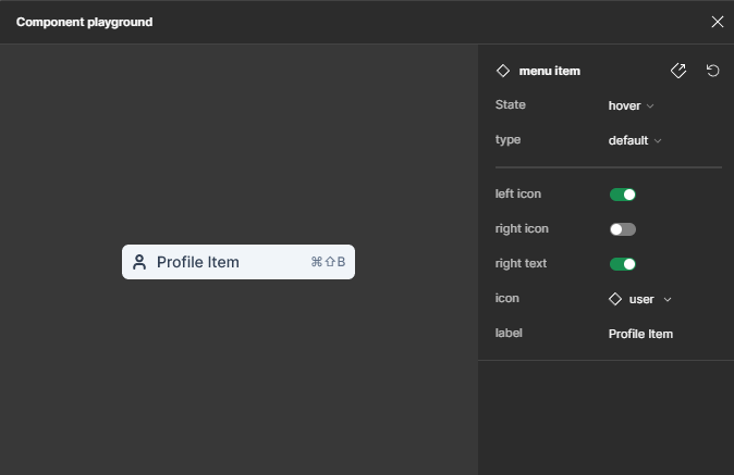
Dev Mode playground looks a lot like StoryBook, a popular tool to display components configurations in isolation.
- Props are clearly defined
- Variants are clearly defined
- States are clearly defined
Code Version of Figma's Dev Mode
interface Props {
  rightLabel: string;
  label: string;
  rightText: boolean;
  rightIcon: boolean;
  leftIcon: boolean;
  state: 'diabled' | 'hover' | 'default';
  type: 'section-title' | 'default';
  className: any;
  icon: JSX.Element;
}
export const MenuItem = ({
  rightLabel = '⌘⇧B︎',
  label = 'Menu Item',
  rightText = true,
  rightIcon = true,
  leftIcon = true,
  state,
  type,
  className,
  icon = <Mail className="secondary-icon" />,
}: Props): JSX.Element => {
  return (
    <div className={`menu-item ${type} ${state} ${className}`}>
      {type === 'default' && (
        <>
          <>{leftIcon && <>{icon}</>}</>
          <div className="text-wrapper">{label}</div>
          <>{rightText && <div className="b">⌘⇧B︎</div>}</>
          <>
            {rightIcon && (
              <>
                <>
                  {['default', 'hover'].includes(state) && (
                    <SecondaryIcon className="secondary-icon" />
                  )}
                  {state === 'diabled' && (
                    <NamecandidateNameSecondaryIconScore101 className="secondary-icon" />
                  )}
                </>
              </>
            )}
          </>
        </>
      )}
      {type === 'section-title' && <div className="div">Section Title</div>}
    </div>
  )
}
Summary
- Shared language is step number 1 to a successful design to engineering handoff.
- Figma's
Dev Modeis a great tool to create a shared language. - StoryBook is another great tool to create a shared language.
- Establishing a shared language is a two way street. Both designers and engineers need to be on the same page.
Performance & Optimization Considerations
Performance & Optimization Considerations:
Responsive Design Strategies: For a UX engineer, responsiveness isn't just about making the design look good on different screen sizes. It involves understanding how components and layouts should adapt to different screen resolutions, aspect ratios, and orientations. This includes the appropriate use of CSS media queries, grid layouts, and flexible box layouts. It's also important to understand how touch targets and navigation might change between desktop and mobile versions.
This is one of the most popular friction points between designers and engineers.
Accessibility Guidelines
Accessibility Guidelines: Your design must be inclusive and accessible to all users, including those with disabilities. Ensure your design adheres to WCAG guidelines and include annotations in your handoff about color contrast, font size, keyboard navigation, alt text for images, and other accessibility considerations.
User Flow Diagrams & State Management
User Flow Diagrams & State Management: Beyond individual screens, it's important to communicate the flow of the application and the different user journeys that can occur. State management diagrams can help engineers understand what actions, interactions, or conditions will move users from one state to another, and what changes to data structures or UI are involved in these transitions.
Technical Documentation & Implementation Guidelines
- Technical Documentation & Implementation Guidelines: Lastly, provide thorough technical documentation that offers context on how the design fits into the larger product strategy. This can include frontend and backend dependencies, API interactions, or unique implementation details for certain components. Additionally, if your design involves new technologies, advanced animations, or complex interactions, include reference materials or implementation examples to assist the engineering team.
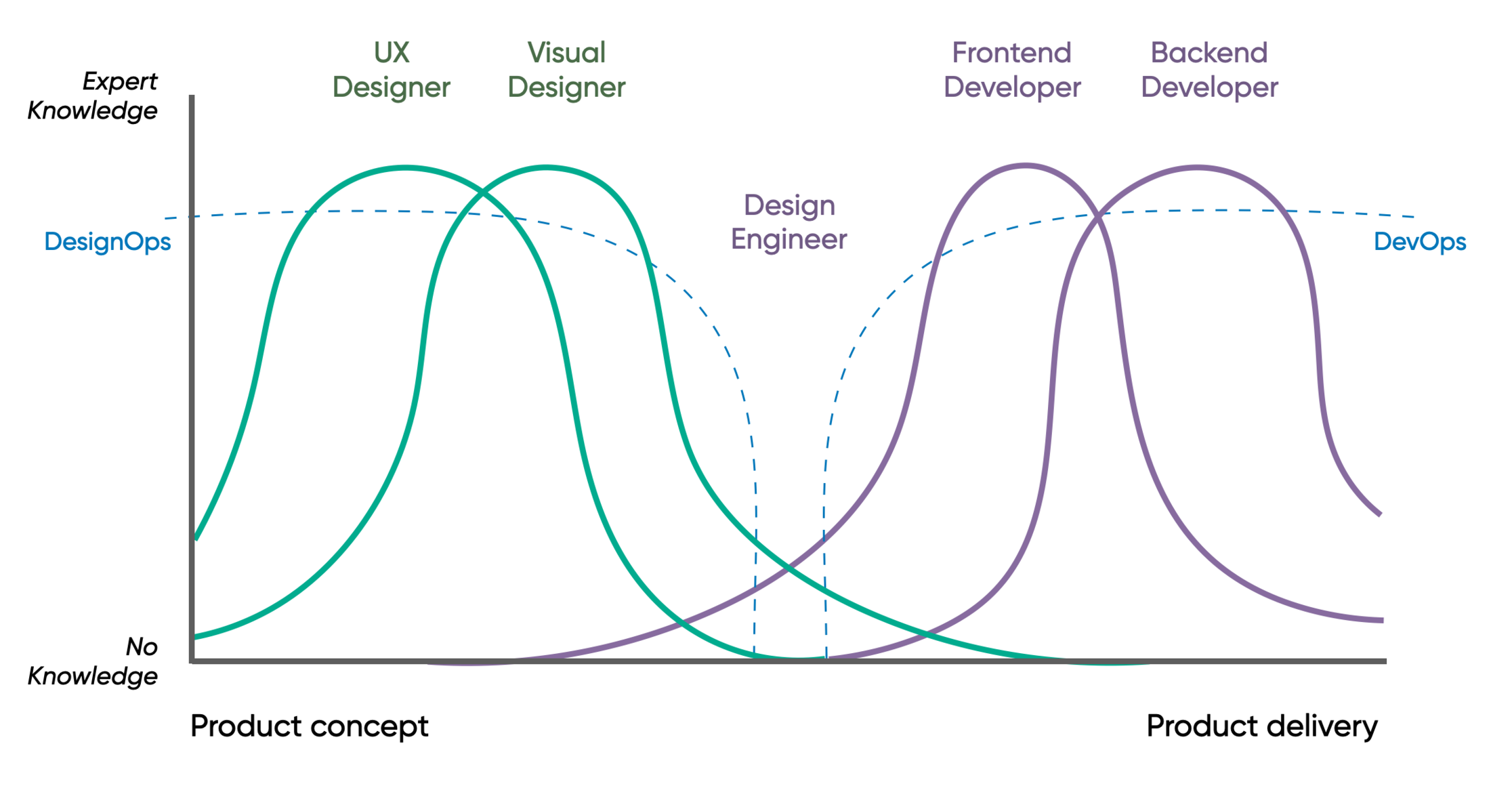
Below is a representations of the organizational structure for Engineer and Designers. The key take away is to unify boy DevOps/ Design ops so there is a shared language.