- Published on
SCSS Architecture (7-1)
The 7-1 SCSS architecture refers to a structure comprising 7 different folders and 1 main file. The main idea is to have a solid, maintainable, and scalable structure for your stylesheets, ensuring your code is organized and your styles are easy to manage.
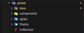
7 Folders and Their Roles
The 7-1 pattern organizes SCSS files into seven different folders, each serving a specific purpose:
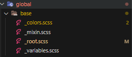
Base: The base folder contains the boilerplate content for the project. It includes resets, typography rules (like fonts), and standard element definitions. This is where you'd put your base and helper styles.
Components: This folder includes individual components, sometimes referred to as modules. Buttons, sliders, loaders, or similar discrete, reusable parts of the interface live here.
Layout: Here, you'd place styles for larger layout components, such as headers, footers, grids, and sections. This folder essentially contains styles for the main sections of the layout, the macro components, if you will.
Pages: This folder contains page-specific styles. If you have a home page with unique styles, they belong here.
Themes: If your website or application has different themes, or if you want to style it differently for occasions, the styles go into this folder.
Abstracts: The abstracts folder is home to the less tangible code in your project. This includes variables, mixins, and functions - any code that doesn't output CSS when compiled.
Vendors: This folder is dedicated to third-party CSS. It's for including stylesheets from external libraries and dependencies, like Bootstrap or jQuery UI.
However, I rarely utilize this exact format. I use this as a reference for my SCSS architecture. I have found that the following structure works best for me.
Light & Dark Mode Setup
Below I have my project set up so that light mode and darkmode is extremly effieicent and easy to maintain. This method allows you to also incorporate other themes into your project very easily.
The CSS custom properties are defined using the -- prefix and the #{$key} variable, which represents the name of the color value. The #{$submap} variable represents the value of the color. The --#{$key}: #{$submap}; line defines the CSS custom property with the name --{key} and the value #{submap}.
@import url("https://rsms.me/inter/inter.css");
@import "variables";
@import "./colors.scss";

:root {
  @each $theme, $map in $themes {
    .theme--#{$theme} {
      @each $key, $submap in $map {
        --#{$key}: #{$submap};
      }
    }
  }
}
The $themes variable here is expected to be a map (in SCSS, maps are like associative arrays or hash maps in other languages) where each key is a theme name (like 'dark' or 'light'), and each value is another map of CSS property-value pairs for that theme.
The outer @each loop iterates over each theme in $themes. For each theme, it creates a CSS class called .theme--[theme name] where [theme name] is replaced with the name of the theme.
The inner @each loop then iterates over each CSS property-value pair in the map for that theme, creating a CSS Custom Property for each pair. CSS Custom Properties have the format --[property]: [value];
I typically utilize this in a React Provider called GlobalProvider which allows me to easily switch between themes. The state changes, and the theme is updated. All the descendants will be updated with the new theme.
  return (
    <GlobalContext.Provider value={ctx}>
      <div className={`theme--${theme === 'dark' ? 'dark' : 'light'}`}>{children}</div>
    </GlobalContext.Provider>
  );
$themes: (
  light: (
    primary-bg: #fff,
    primary2-bg: rgba(255, 255, 255, 1),
    secondary-bg: #f8f8f8,
    tertiary-bg: #ccc,
    primary-text: #000,
    secondary-text: #545454,
    track-color: #c4c4c4,
    thumb-color: #e1e1e189,
    tertiary-text: #666,
    link-color: #0000ff,
    link-hover-color: #ff0000,
    button-color: #f2f2f2,
    button-hover-color: #c7c7c7,
    font-size: 16px,
    line-height: 1.5,
    border-color: #e5e5e5,
    border-color2: #c3c3c3,
    border-radius: 3px,
    box-shadow: 6px 10px 30px 0px rgba(0, 0, 0, 0.1),
    shadow: 0 1px 3px rgba(0, 0, 0, 0.1),
    rgba-primary-bg: rgba(255, 255, 255, 0.32),
    rgba-secondary-bg: rgba(255, 255, 255, 0.19),
    bubble-color: #fff,


    //  NavBar
    nav-bg: #fff,
    nav-bg2: #e1e1e1,


    //  SideBar
    sidebar-bg: #f6f6f6,

    chat-bg: #fff,
    chat-border: #f2f2f2,

    tab-container: #efefef,

    // Modal Styles
    modal-bg: #fff,
    modal-border: #e5e5e5,
    modal-shadow: 0 1px 3px rgba(0, 0, 0, 0.1),
    live-bg: #f3f3f3,
    live-class: #e4e4e4,
    live-class2:  #dedede,

    live-border: #d4d4d4,
    live-arrow: #252525a3,

    addNode-border: #6e6e6e,
    addNode-border-left: #6e6e6e,

    fieldsManager-bg: #fff,

    assetManager-bg: #e5e5e5,
    assetManager-border: #e7e7e7,
    assetManager-border2: #d2d2d2,
    assetManager-card-bg2: #f2f2f2,
    assetManager-row-bg: #fff,


    highlight: blue,
    selected: #e5e5e5,


    // FAB
    fab-bg: #fff,


    search-bg: #fff,
    search-block: #bbbbbb,
    font-weight: 400,

    divider: #e5e5e5,

    command-bg: #fff,
    command-bg2: #f8f8f8,
    command-text: #000,
    command-border: #e5e5e5,
    command-border2: #c3c3c3,
    command-shadow: 0 1px 3px rgba(0, 0, 0, 0.1),
    resizer: #d9d9d9,
  ),

  dark: (
    primary-bg: rgb(16, 16, 16),
    primary2-bg: rgb(25, 25, 25),
    secondary-bg: rgb(43, 43, 43),
    secondary2-bg: #1b1b1b,
    tertiary-bg: #666,
    track-color: #2b2b2b,
    thumb-color: #68686889,
    primary-text: #fff,
    secondary-text: #ccc,
    tertiary-text: #999,
    link-color: #33aaff,
    link-hover-color: #0088ff,
    button-color: #2b2b2b,
    button-hover-color: #1b1b1b,
    font-size: 16px,
    line-height: 1.5,
    border-color: #555,
    border-color2: #333,
    box-shadow: 0 1px 3px rgba(0, 0, 0, 0.3),
    border-radius: 3px,
    shadow: 0 1px 3px rgba(0, 0, 0, 0.3),
    rgba-primary-bg: rgba(16, 16, 16, 0.32),
    rgba-secondary-bg: rgba(43, 43, 43, 0.19),
    tab-container: #161616,

    font-weight: 200,

    bubble-color: #2b2a2a,

    chat-bg: #101010,
    chat-border: #55555589,

    // NavBar
    nav-bg: #161616,
    nav-bg2: #2f2f2f,


    // SideBar
    sidebar-bg: #161616,

    // FAB
    fab-bg: rgba(39, 39, 39, 0.9),

    live-bg: #0f0f0f,
    live-class: #161616,
    live-class2: #262626,
    live-border: #555555a3,
    live-arrow: #f2f2f2a3,

    fieldsManager-bg: #131313,

    divider: #55555589,

    modal-bg: #161616,
    modal-border: #55555589,
    modal-shadow: 0 1px 3px rgba(0, 0, 0, 0.3),
    addNode-border: #606060,
    addNode-border-left: #606060,

    assetManager-bg: #282828,
    assetManager-bg2: #161616,
    assetManager-border: #8686865e,
    assetManager-border2: #8c8c8c89,
    assetManager-row-bg: rgba(48, 48, 48, 0.538),
    assetManager-card-bg: rgba(59, 59, 59, 0.7),
    search-bg: #181818,
    search-block: #2b2b2b,

    command-bg: #161616,
    command-bg2: #1b1b1b,
    command-text: #fff,
    command-border: #55555534,
    command-border2: #333,
    command-shadow: 0 1px 3px rgba(0, 0, 0, 0.3),
    resizer: #2a2a2a,
  ),

);